Finasset Dashboard
Introduction
In a previous post we gave some insight on how Datapta specializes in using data from Twitter to generate useful information about the economy and the stocks market. This post will focus on what type of data is shown and how it can be used.
All graphs shown in this post can be found at https://datapta.com/finasset, where user can take a first look at Datapta’s upcoming product, which is divided into four sections. This product will provide its users with the latest data available as well as an historic evolution, allowing them to make the right decisions in order to maximize benefits and minimize loses.
Historical data
First of all we will focus on historical data and the evolution until the moment the user sees the data. This evolution is usually shown in lineplots when talking about simple values and in candlebars when talking about prices. In the available dashboard historical data corresponds to the sentiment evolution and the amount of data retrieved, both simple values.
The first section of the dashboard shows the data generated from the prediction models used.
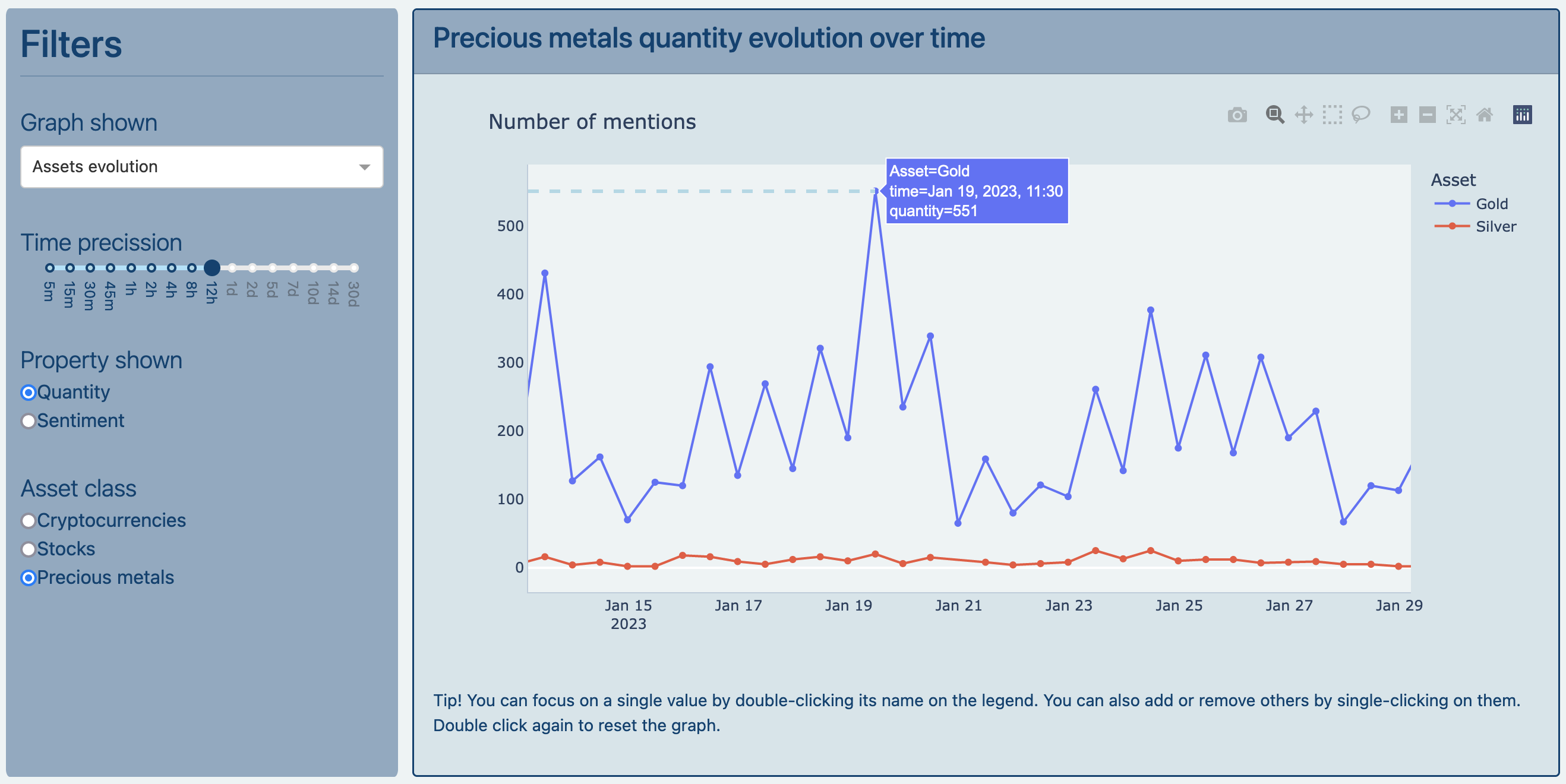
This section can help the user identify trends or patterns such as lower volume of tweets at midnight. In addition to daily patterns, a bigger scale can show whether the volume of tweets has grown or decreased steadily (gaining or losing popularity), for example.
In order to help the user identify said trends, several filters are provided to select the type of data show as well as the time precission. A smaller time precission translates into much more data points, which is useful when using smaller time scales (focusing on the last couple of days, for example), whereas a bigger time precission translates into less data points, which is useful when focusing on a bigger time scales like weeks or months. These filters have a graph selector to change between data types (assets vs economy) and variants of graph types (lineplots vs percentage area charts).
The second section of the dashboard shows the data generated when retrieving data from Twitter, that is, the rates of obtainment.
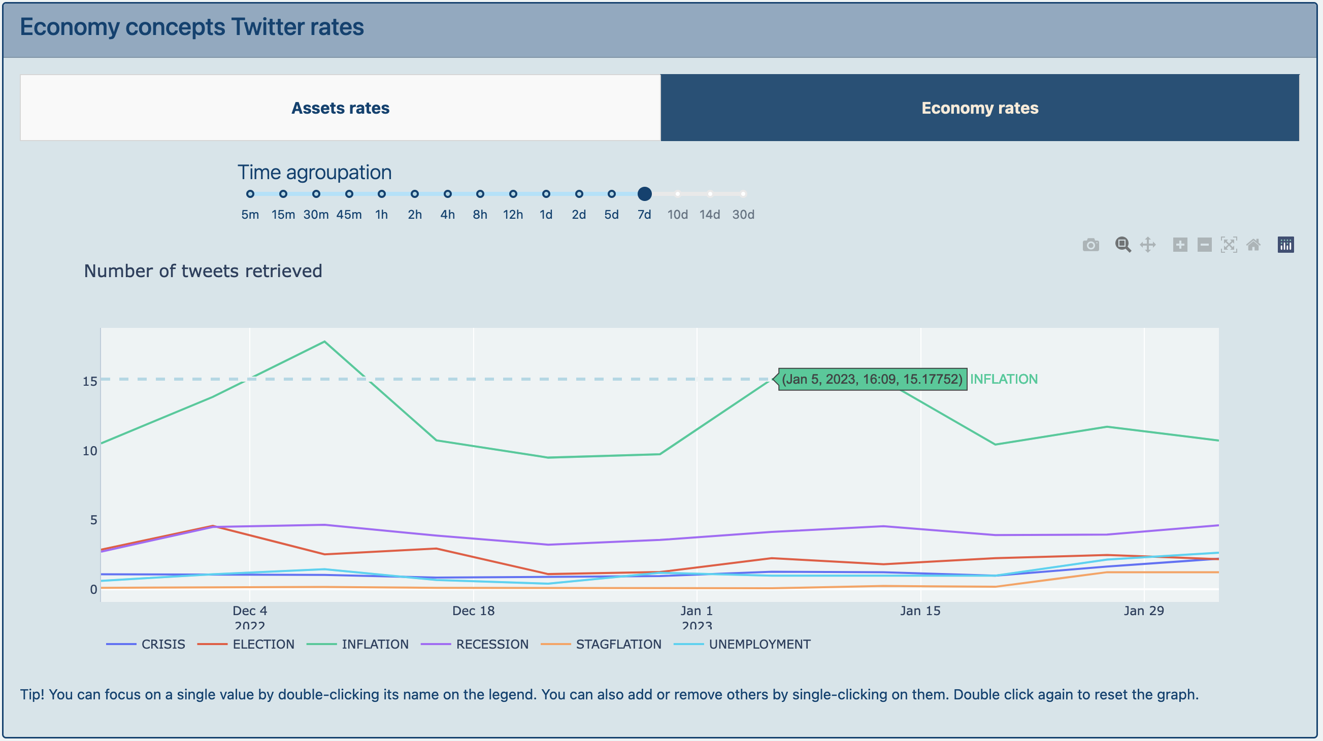
In contrast to the first section, the data shown also contains non-cleaned tweets. That is, the value shown takes into account tweets that might only contain cashtags or hashtags or that might have no sentiment associated.
As well as on the prior section, there are filters to modify the time precission and changin from data types is made with tabs.
Latest data
The following two sections focus on the latest data or value that has been generated up until the moment the user sees the data. In other words, if the first two sections focused on the evolution until ‘now’, these sections focus on the ‘now’ values.
If the user selected the smallest time precission and selected a time scale focused on the ‘now’, the values shown would be the same. To make it easier for users and to allow them to see both historical data and the latest value at the same time the following sections have been added separatedly.
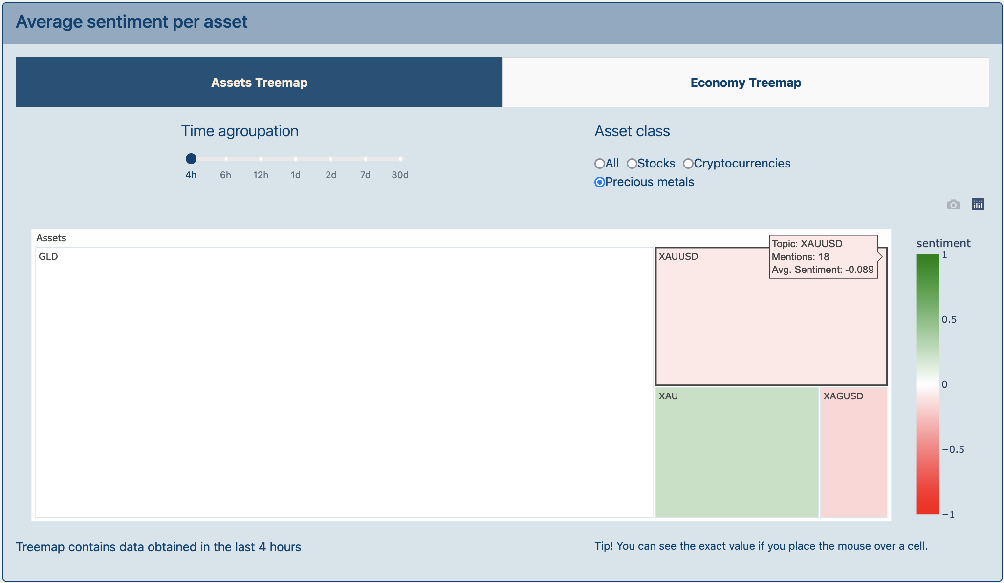
The third section of the web shows both the amount of data retrieved and the average sentiment. This is portrayed as a treemap where the size corresponds to the number of mentions and the color matches the sentiment on a scale from -1 to 1. This representation allows the user to identify very easily whether an assetis popular or not (according to the size of its square) and whether its sentiment is positive or negative (close to 1/darker green or -1/brighter red respectively) or neutral (close to 0/white-ish color).
In addition to showing different assets or economy concepts, clicking on an economy concept will show a second level of the treemap to visualize the entities identified related to each concept.
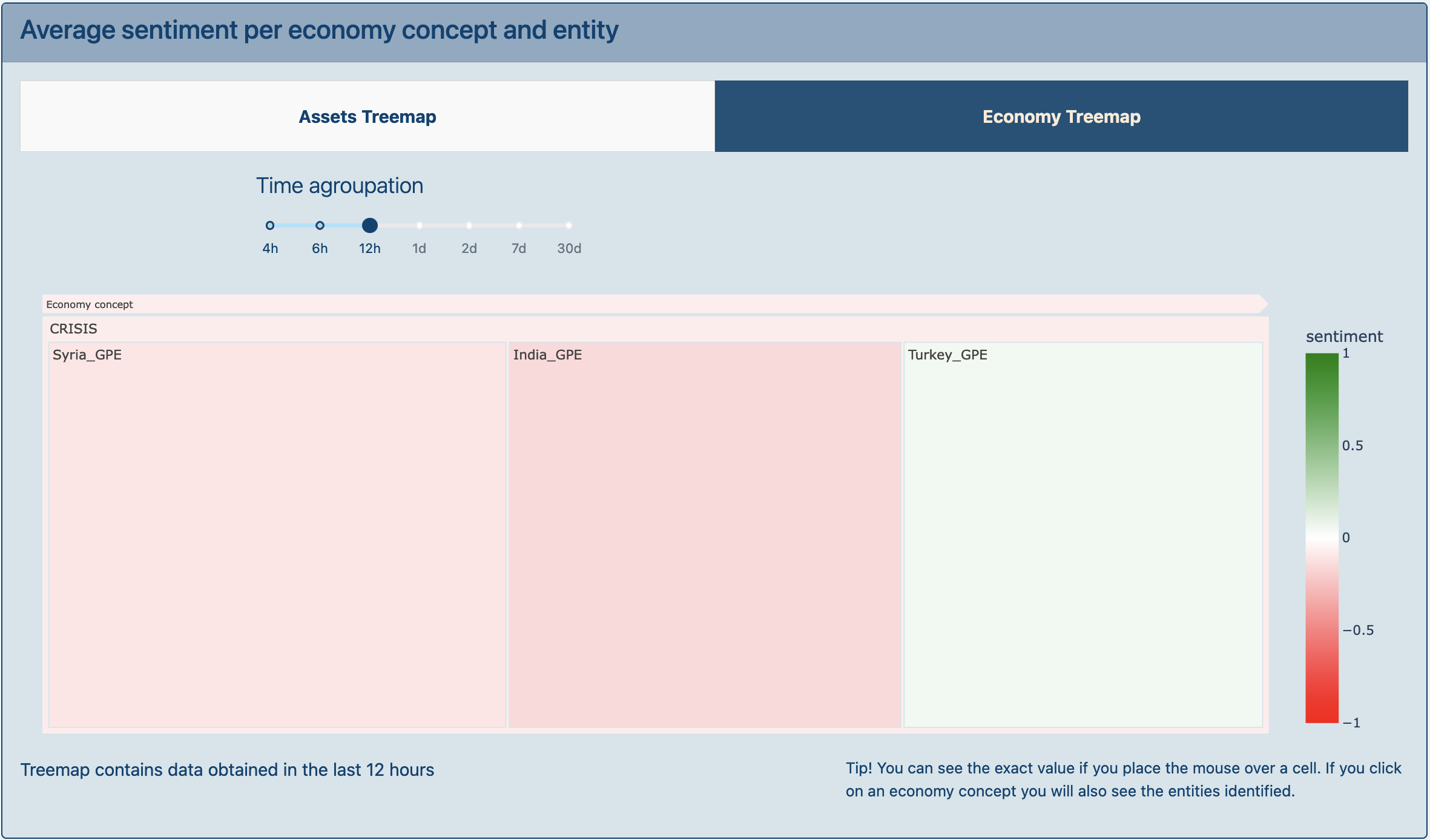
In combination with the third section, there is a variant on the visualization of the economy concepts and the entities identified. This visualization is shown in wordclouds that only portray the amount of data shown for each concept. There are several options to select the type of data to show as well as a filter to increase or decrease the selected time.
The purpose of this section is to emphatize on relevant topics so users can get an idea of what events have been on the rise lately. Thus, this section does not show the sentiment associated with each topic.
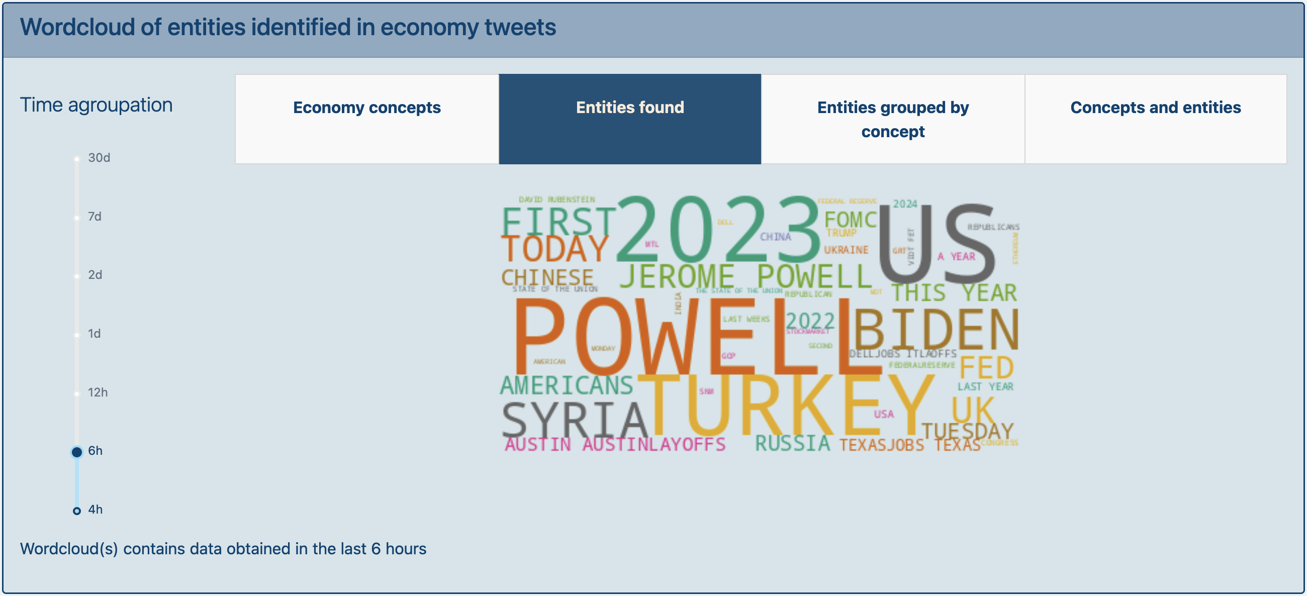
If we take a look at the wordcloud shown we can easily identify (Jerome) Powell, Turkey and Syria as some of the main entities identified:
- Jerome Powell has been the chair of the Federal Reserve since 2018 and its relevance on the data retrieved might indicate there has been an announcement from the FED for example.
- Syria and Turkey, on the other hand, are relevant because of the earthquakes they suffered on the first week of February. These entities identified are not specifically about economy but may still have an impact on the economy of both countries and the products they export.
With this data users can value different events that might have an impact on the economy evolution and might influence the market, giving them more information to take into account before making an investment.
Shared This!


